- JKR It was pretty good. The end kind of...
- @ebolaworld No. *gets whip* ...
- @ebolaworld Mmmmmkay... ^_^ ...
- Mr. Pondersome Quietly macabre and twisted humour....
- A Whole New World! (34)
- Ebolaworld Not So Live (31)
- New Cartoon in the Works! (19)
- A Message From Sam T (17)
- Home
- Advertise
- Archives
- Ask Taco-Man
- Cat and Fish
- Contact
- FAQ
- Grandpa
- History of Ebolaworld
- Messing with Seaman
- Products Page
- sidebar2
- Smokey the Cigarette
- Snowy the Frostman
- Store
- Taco-Man Plays a Video Game
- Taco-Man the Game Master
- The Good Life
- The Linda Show
- The Smurks
- The Stupid Adventures of Taco-Man
- Messed-Up Bible Stories
- Life in the Portal
A Whole New World!
 The old clunky flash site is gone and you can now navigate and socialize with ease. Be sure to subscribe, so you’ll never miss an update. Here’s what’s new:
Comments:
You can now use your Twitter and/or Facebook accounts to leave a comment, rate others, insert images, subscribe, and even post a freaking video! Why, you can test it out now by leaving a comment on this post! A forum may be forthcoming if demand is high, so let me know.
Movies:
Your favorite Series and Episodes can be easily accessed using the drop down menus above, and they update themselves automatically when a new cartoon is upload (So, no more waiting on Sam’s lazy ass). Or, if you’re feeling nostalgic, take a trip down memory lane on the Ebolaworld Archive page. The episodes aren’t linked yet, but will be soon. However, some will never be available for viewing again.
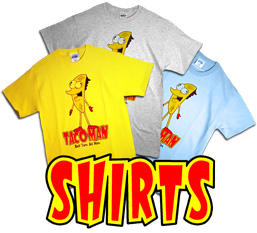
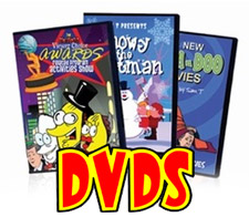
Store:
Ebolaworld shirts have been requested for a long time, and they are finally here - however limited. So grab yours while you can! The Awards Show DVD is now available and even has a awesome promo video you won’t want to miss (Trust me)! Have you ever wondered what you would look like as an Ebolaworld character? Wonder no more, as you can now get Ebola’d (Coming soon). Lastly, Sam will be selling some of his source FLA. None are for sale yet, but coming soon. You’ll be able to dissect his cartoons and see how they came together. Who knows what secrets may lie inside.
FAQ:
Where did the name Ebolaworld come from? What are the origins of Taco-Man? Is the Snowy series really ending in 2010? All these questions and more are answered on the FAQ page. Have a question that’s not there? Email me at faq@ebolaworld.com.
Frank over at FJMdesigns.com helped me set up the new website and fixed everything I broke. Thanks again Frank! If you need a website or design, feel free to contact him at frank@fjmdesigns.com! Also, thanks to my beta-testers for finding all the bugs, and reminding me about the Linda Show page every damn day. (Inside joke) :P
It probably doesn't help if I'm not honest with you about the new look. I could tell you I like it, but I don't. It looks like a blog now, and not a particularly good one at that. I don't mean to offend; I certainly understand the reasons for the choices made, but from a professional designer's standpoint it's a step backward. Functionally forward, but I'd suggest you continue to tweak things design wise because they simply feel soulless and like a template lacking changes. Again, I'm not trying to be overly critical, merely informative and helpful. I really enjoy the cartoons (which is what it's all about anyway) and hope more people will come to watch them.
The ad banner at the top of the page, unless making you millions of dollars, REALLY needs relocated. It gives a terrible, TERRIBLE first impression. One that screams "I just want to make money" and nothing more. Please, if nothing else, relocate that ad. Even under the logo would be better (though still not ideal). It is in a terrible place as your first impression of the website. That is one thing I can't stress enough from a designer's standpoint. That NEEDS moved.
I understand the need to latch on to the latest fads, and the inclusion of the twitter and facebook sidebars, but remember that often times less is more. They clutter things up to a tremendous degree as they are now, and the eyes have a difficult time deciding where to look first. Visual noise like this will drive new viewers away, even if current viewers might grow accustomed to it all.
Anyway, I hope any of that proves somewhat useful. I wish you all the best of luck; I've been checking in on Ebolaworld now and again since nearly day 1 and love a lot of the characters. Here's to a great future for your art, and take care!
-JKR
FredtheMonkey.com
is it just me or am i imaginating… the ads don't show up on my firefox browser
You prolly have an ad blocker widget on FF. I have a friend that sees no ads either for that reason. :P
also sometimes the comments goes back to the old one… (the one when I was beta testing) I thinks it was the defult Word Press coments..
That, I don't know. I always see the same new comments. Anyone else have this issue?
well now, i don't experience though problems… maybe it was a temporary glitch or somethin…
It probably doesn't help if I'm not honest with you about the new look. I could tell you I like it, but I don't. It looks like a blog now, and not a particularly good one at that. I don't mean to offend; I certainly understand the reasons for the choices made, but from a professional designer's standpoint it's a step backward. Functionally forward, but I'd suggest you continue to tweak things design wise because they simply feel soulless and like a template lacking changes. Again, I'm not trying to be overly critical, merely informative and helpful. I really enjoy the cartoons (which is what it's all about anyway) and hope more people will come to watch them.
The ad banner at the top of the page, unless making you millions of dollars, REALLY needs relocated. It gives a terrible, TERRIBLE first impression. One that screams "I just want to make money" and nothing more. Please, if nothing else, relocate that ad. Even under the logo would be better (though still not ideal). It is in a terrible place as your first impression of the website. That is one thing I can't stress enough from a designer's standpoint. That NEEDS moved.
I understand the need to latch on to the latest fads, and the inclusion of the twitter and facebook sidebars, but remember that often times less is more. They clutter things up to a tremendous degree as they are now, and the eyes have a difficult time deciding where to look first. Visual noise like this will drive new viewers away, even if current viewers might grow accustomed to it all.
Anyway, I hope any of that proves somewhat useful. I wish you all the best of luck; I've been checking in on Ebolaworld now and again since nearly day 1 and love a lot of the characters. Here's to a great future for your art, and take care!
-JKR
FredtheMonkey.com
Thanks for sharing your opinion. Obviously, I'm not going to agree with you on all points, but I understand that the site may feel a bit hollow right now as a lot of it is incomplete, however that will change over time.
On my old site, the blog was the most visited page, so it only made sense to make it the center piece. I don't think anyone here, including myself, misses the old site, as it was all-flash, making updating and navigation a real pain. Honestly, In this new internet landscape, where my stuff is widely available elsewhere, a personal website isn't even needed. But, I wanted one where I could interact more personally with my fans, and have a place to call home.
I noticed in your second post that you complained about the low number of series last year. There were 7. Please show me another single artist website with more. Yet, in this post you complain about the ads. The ads, like them or not, help me bring in a little bit of cash to extend my hobby of making cartoons. So, you can't have it both ways. If you don't like the ads, install an ad blocker. They do work. But, if you wish for me to release more videos, like you claim, then you should be wishing that I'd make all the money off of the work I can. Otherwise, you will only see a decrease in the videos as I have to do other things to make ends meet.
Not speaking a website designer and more of a fan, I agree with certain points on both sides. Unless Sam is making tons of money, the ads are a necessary evil and I also agree that it's hollow because things have just started. I think there is a lot of potential to do more, but for now, taking it one step at time would be best. One thing that JKR said that I agree with is that the main page is a little crowded and everything blends together a little. I think a little more structure would help, but again, things will of course progress, and I am also a firm believer in it being what Sam wants it to be. It's his home. The only real suggestion I have is the twitter thing could just be limited to a "Follow me" button.
Other than that, I'm very excited to see everything started up and I'm ecstatic to be a part of it! Thanks Sam!
I actually did have a different bg color for the side panel and a line breaking it from the blog, however, they had to be removed due to site issues. I could have them put back if you think that would help. Thanks for the input!
I like it better without the line in the side. Makes the site look smaller now,,,,
Well I suppose it's a difference in opinion that a personal website isn't needed. I know when I find a cartoon I enjoy, the first thing I do is try to find its personal website, because then I can skip all the annoying extra crap and get right down to watching everything. In fact, I'd say it's more important now than ever before. But it's your site, so you have to do what's best for you. I'm merely trying to assist in making things better, but obviously you have the final say, and if you're happy then that's extremely important.
The blog was the most visited page on your old site because it was the most updated page. That tends to happen. I mean, I didn't even go to the main site anymore for the last few months, just bookmarked the blog and followed the links you posted. Kind of a catch-22. You update the blog, as a result it becomes the most popular, so you alter the site to be like the blog that you made most popular. I'm not a proponent for the old Flash site here, I'm merely saying this new one makes it seems more like you are new to this. If I weren't a visitor from years back and just came across this, I'd think this was a new website, not one years old. (A major reason is the ad above the logo.) It has the design of something that hasn't been around very long. Which I suppose also makes sense, because it is your first foray into the non-Flash based site. Over time I'm sure you'll upgrade it to be less template-like. That's cool, and all part of the process of growing a website.
You misunderstand me about the ads. Let me try to explain again. I am not saying "OMG DON'T HAVE ADS!!!1!" but explaining that if you put an ad ABOVE your logo, it is not a good thing at all. Go to any major website. IGN.com, Newgrounds, CNN, Penny Arcade. etc. The FIRST thing you have is the logo. Always always always. This is extremely important from a human-base standpoint when arriving at your site the first time. I can't stress it enough. You can go ahead and not trust me, that's fine, just go see for yourself. There are dozens of books on the subject. It's a simple change that make an ENORMOUS difference. Enormous. I'm not saying get rid of the ads. I'm saying the #1 thing that absolutely needs to be at the top of your site is your logo. Keeps the ads if they help you make money. I'm no longer young enough to believe that money isn't one of those needed things to keep you able to make the cartoons. I think you're doing a bang-up job with most things, and you've certainly made me a life-long fan. Again, not complaining, suggesting. Voicing thoughts.
So really, I beg you move the ad down under the logo. I can't stress enough how important that one little thing is when it comes to the subliminal marketing of the human psyche. I know it sounds crazy, but there are millions of studies. You can find them, and you can see every single other big website with the click of your mouse. It is only the blog "real-website-wanna-be's" that put the ad above the logo, and it's because they don't know any better. Simple fix, huge difference.
Take care, and keep up all the great work!
Again, thank you for your input. A lot of time, thought, and planning went into this for well over a year. I know it's not perfect, but it's a lot better than what I had. I'm not really sure why some of you are calling it disorganized. I assume you're wanting a line separating the blog from the side panel, or a different color for the side panel. Otherwise, you must be seeing something I am not. To me, the site has a very clean look to it, which I like. Also, I didn't just slap my content onto a pre-made template. It started out as one of course, but was heavily altered to match my original mocks. As for the ad, I understand what you're saying about how other sites have their logos on top of the ad, but I think they do that so the ads are more in your face. I honestly hate the layout of logo - gap for ad - and site content. It breaks the page up, and to me looks more like “We want money”. I decided to keep my ad on top as to not break the site. The first thing I see when I arrive is my logo. Also, moving the ad under the logo would ruin what happens when you click the logo, and would also limit what I could do there. ;)
However, I will take your thoughts into consideration as I continue to work on the site. Thank you!
Well it's up to you. I know you're well aware that what you see as the designer and what the world sees as not the designer is very different. While you see the logo first, others won't. But again, up to you. Just trying to assist.
As long as the cartoons keep coming! :)
I understand what you're saying, but you make it seem like it's me against the world. I'm sure just as many people out there will think my way as they do yours. Regardless, i think I made the right choice. And remember, I'm not just the designer, but a viewer too. ;)
More cartoons are in the works!
SWEET!
when is history of ebolaworld coming out?
Probably next month. Just so busy at the moment.
OOOO! Interesting Advertisement…. Better click it… ohhhh, to lazy….
Sam, this looks very professional. Congratulations!!!
P.s, im starting to get into the pro world of voice acting myself. Im finally making money. Woopee. Hope to work with you soon bud!
Congrats to you too. Tell me more when you have the time!
The new site looks great and I love the new logo animations. The new DVD looks awesome too.
Thanks for testing!
No problem, it was cool looking through the site and reminding you that the Linda page was broken.
And I just noticed today that each video ends with its own goofy phrase. XD
oh ya, just noticed, you fixed the linda page…. Now better find another glitch to remind you everyday.
Another question, I noticed on the Ask Taco-Man page there is a phone number? Can we call Taco Man like you had going for awhile last year and possibly get featured in a cartoon? That'd be pretty funny haha.
Yes. I plan to embed some of the calls and post the emails on his page as well.
Sweet I didn't know it was even on there, I just remembered it reading through the archive. I was wondering what ever became of it.
You can reply to my reply. :P
o rly?
Yup.
Night Trap! That's the name I was trying to think of!
Awesome Sam T! I love the new site design! Although, what will ever become of flash interactive fun stuff like that old Taco Man Halloween type game where you can see all the different cameras. The thing that was a parody of the Sega CD game? I LOVED THAT THING! Will that ever come back to the site? It was pretty clever and original.
Yeah. I plan to add a link to it on Newgrounds.